
Social media is visual media.
And this is with good reason, as Dr John Medina mentions in his book Brain Rules:
“If the information is presented orally, people remember about 10 percent, tested 72 hours after exposure. That figure goes up to 65 percent if you add a picture.”
Even less ostensibly “aesthetic” social platforms are increasingly dominated by visual elements. For instance, internal data from Twitter/X shows that posts containing videos generate 10X the engagement of non-video posts.
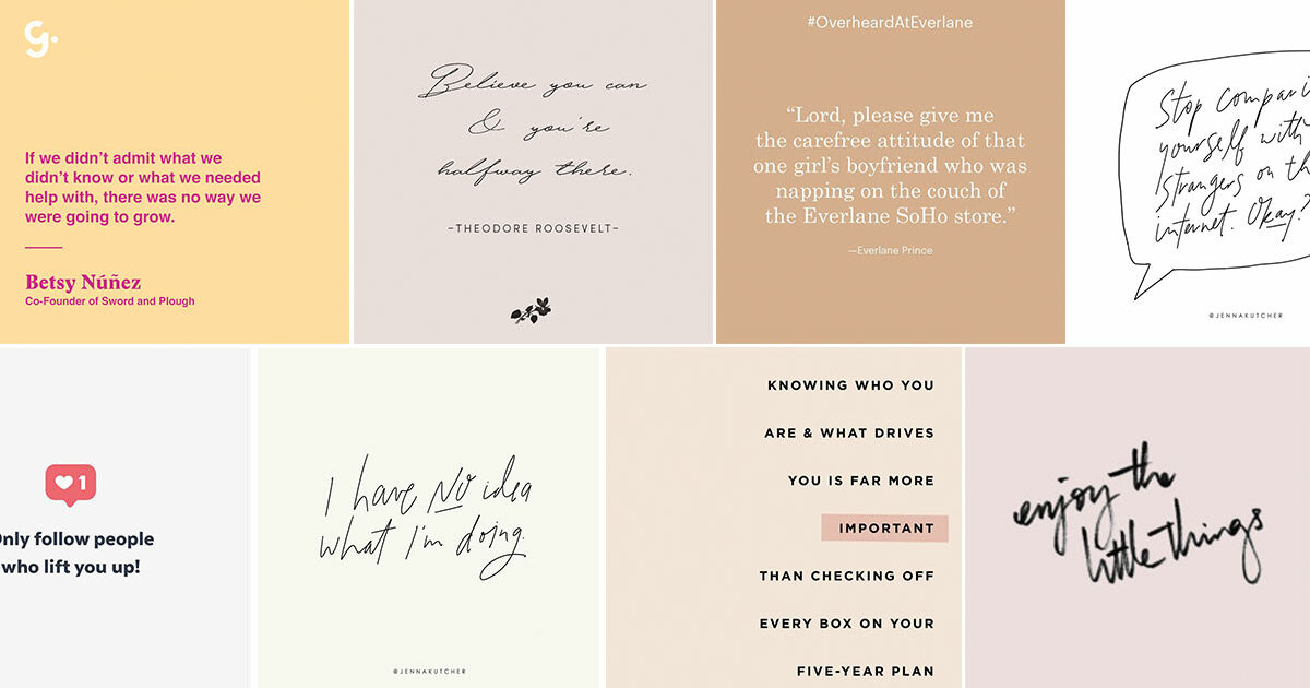
Marketers often get stuck trying to find the right creative elements for all their visual needs. And while photos and videos (either stock or branded) are great content to have in your toolbox, so are social graphics.
The most successful social graphics are branded consistently but designed to fit within the platform environment on which you’re posting.
Fortunately, you don’t need to be (or have access to) a designer to make highly engaging branded social graphics. To get started creating your own, just follow these best practices.
1. Understand Platform-Specific Image Dimensions
We’re big fans of working smarter, not harder, by sharing similar content across multiple social networks. But if you create native-feeling branded social graphics, you’ll need to design them with individual social platforms in mind because each has its specific requirements.
To make your life easier, here’s a list of all those requirements for each of the major platforms, which is up to date at the time of writing:
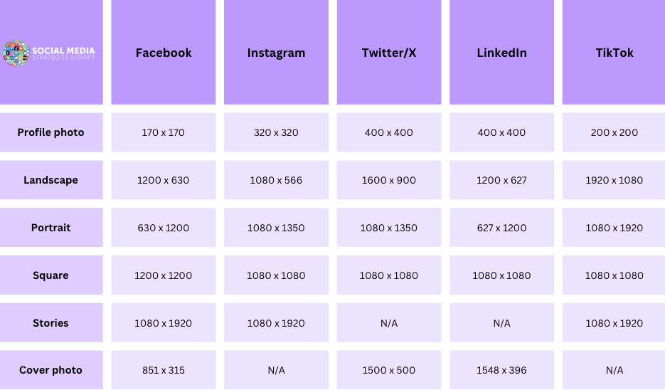
Facebook Image Sizes
- Profile photo: 170 x 170 pixels
- Landscape: 1200 x 630 pixels
- Portrait: 630 x 1200 pixels
- Square: 1200 x 1200 pixels
- Stories: 1080 x 1920 pixels
- Cover photo: 851 x 315 pixels
Instagram Image Sizes
- Profile photo: 320 x 320 pixels
- Landscape: 1080 x 566 pixels
- Portrait: 1080 x 1350 pixels
- Square: 1080 x 1080 pixels
- Stories: 1080 x 1920 pixels
- Cover photo: N/A
Twitter/X Image Sizes
- Profile photo: 400 x 400 pixels
- Landscape: 1600 x 900 pixels
- Portrait: 1080 x 1350 pixels
- Square: 1080 x 1080 pixels
- Stories: N/A
- Cover photo: 1500 x 500 pixels
LinkedIn Image Sizes
- Profile photo: 400 x 400 pixels
- Landscape: 1200 x 627 pixels
- Portrait: 627 x 1200 pixels
- Square: 1080 x 1080 pixels
- Stories: N/A
- Cover photo: 1548 x 396 pixels
TikTok Image Sizes
- Profile photo: 200 x 200 pixels
- Landscape: 1920 x 1080 pixels
- Portrait: 1080 x 1920 pixels
- Square: 1080 x 1080 pixels
- Stories: 1080 x 1920 pixels
- Cover photo: N/A
2. Consider the Goal of Your Graphics
Now that we’ve covered the basics of how big your images should be for each platform, let’s get into the more creative considerations of designing branded social media graphics.
The first step in designing an asset for your brand is to think about why you need it and what it will need to accomplish. You will likely have several goals, but we encourage you to dig deep and think through the question: how will this graphic add value to my audience?
Social graphics are often a source of entertainment or information for audiences, so it’s important that your final design achieves this goal. Other brands aim to surprise and delight their audience through creative animations or unexpected treatments. Whatever your goal, document it before starting the design phase.
This will help communicate art direction to a designer or keep you focused on your ultimate “why” if you do it yourself.
3. Pick Your Brand Elements
If these graphics are for an established brand, you likely have assets you can work with.
However, you won’t necessarily want to include them all.
Social graphics are a delicate balance of brand consistency and creating truly social content — they must fit the platform’s environment.
To determine which elements to keep and which to skip, we recommend pulling your current branding together (either on a physical board or digitally) and asking a few questions to facilitate the editing process.
- Which of these elements are must-haves? (Believe it or not, it might NOT be your logo)
- Which of these elements don’t fit the social environment?
- Which of these elements are easily translatable to social media?
- What three to five words do I want to make sure get captured in my design?
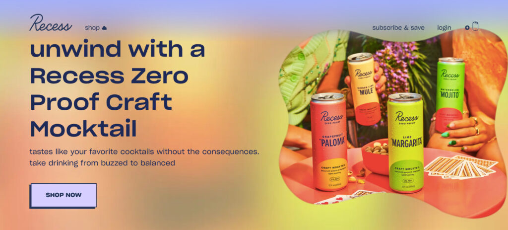
For a practical example, let’s look at the soft drink brand Recess, which maintains consistency across multiple channels while still adhering to the “feel” of each platform.
It maintains the same soft, colorful aesthetic across its website and its Instagram account:
View this post on Instagram
And while branded elements — like the Recess logo — appear in most of their social posts, they’re rarely the focus of attention. Whereas on their website, the logo is a constant companion at the top of the screen:
![]()
4. Maintain Consistency & Creativity
It can take anywhere from five to seven impressions for people to begin to recognize your brand. And if you consider that hardly anyone in your audience will see everything you post, consistency is essential long after you’re ready for a change.
But consistency doesn’t necessarily mean that each social graphic you produce should be the same. There’s always room for creativity.
For instance, POPSUGAR Wellness posts a lot of social graphics and images overlaid with inspirational and educational text. While the visual elements can vary widely from a stylized Sagittarius symbol…
View this post on Instagram
…to a picture of some sprouts…
View this post on Instagram
…the constant font and presence of the POPSUGAR logo helps these graphics maintain a consistent style. The result is a grid that feels diverse, creative, and fun while still on-brand.
5. Create Your Own Social Media Graphic Templates
Those new to designing and expert designers can benefit from social media templates.
Developing your own templates takes the guesswork out of design, making creating consistent, on-brand graphics quick and easy. It also allows all non-designers on your team (and across your organization) to build visual elements for social media, enabling more people to get involved in the content creation process.
It also makes for a more efficient content workflow because you’re not waiting for a single professional designer to craft each graphic from scratch.
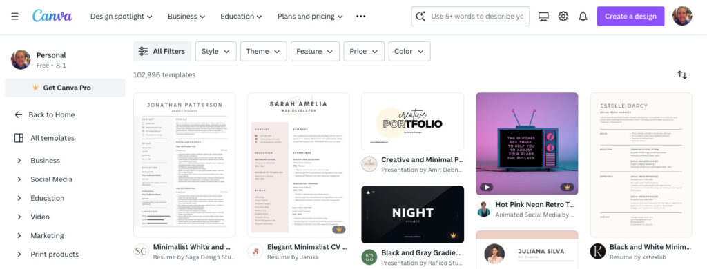
Two of our favorite graphic design tools are Canva and Adobe Express. At the time of writing, Canva has a library of more than 102,000 social media graphic templates:
Once you’ve designed your template, save it wherever it’s easiest to access and update.
Batch your graphic creation so that you are creating several graphics at once. Then load them all into your scheduling tool, post, and share!
One word of caution on using third-party templates: they’re a fantastic source of inspiration, but you should never forget that you want your graphic to fit your brand.
6. Make Use of White Space
One of the most common mistakes made by graphic design newbies is feeling like they have to fill every pixel with visuals, logos, text, and other elements.
The maximalist approach can produce some pretty unique designs. But it also can produce graphics that look too cluttered to tell a story effectively.
That’s why less is often more when creating branded social graphics.
Embrace “white space” — the gaps between text, graphics, and images — to create more harmonious visuals that naturally draw the eye toward a specific focal point, helping communicate your messaging.
Slack, the workspace instant messaging platform, does this better than most.
View this post on Instagram
Technically, this branded social graphic example is loaded with design elements — different fonts, graphics, and even a bunch of corporate logos on the final slide.
Yet because they’re all surrounded by negative space, the resulting graphics never feel too busy.
7. Design With Mobile in Mind
While you might reminisce about the days of logging on to Facebook on your parents’ desktop PC with a dial-up internet connection, the vast majority of people now access social media platforms via mobile.
An astonishing 99% of all social media users check social media on mobile devices, while 78% exclusively access social networks via their phones.
This poses a potential design headache for social media marketers because most still use desktop tools to create social graphics.
Sure, as long as you use the recommended image dimensions for each social platform, you shouldn’t go far wrong. But it’s still worth testing how your design looks on a smaller screen to ensure everything’s still readable.
8. Use Bold Colors To Stop the Scroll
Your branded social graphics compete with a ton of other content, so it’s in your interest to create attractive designs.
One of the best — and simplest — ways to do that is by making use of bold colors in your graphics, just like the bedding brand Brooklinen does:
View this post on Instagram
Take the time to scroll through their Instagram grid, and you’ll see they don’t just use the same bold color over and over again:

Instead, they use a broad — but always striking — palette to catch the eye while ensuring their designs remain interesting.
9. Learn the Rule of Thirds
The rule of thirds is a graphic design tactic that aims to draw the gaze toward an image’s focal point while effectively using empty space.
If that sounds complicated, don’t worry because it’s super simple: designers place a grid of three rows and three columns over the top of their graphics. The focal points should ideally align with the areas where the different grid lines intersect:
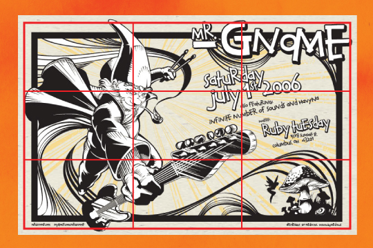
Another big benefit of the rule of thirds is that it makes your social graphics look more interesting by ensuring that not everything happens right in the center of the image.
Most graphic design platforms feature a built-in grid tool to help you leverage the rule of thirds in your creations. For instance, here’s a helpful guide to using Canva’s grid functionality.
10. Consider Your Color Combinations
Most social media marketers have some sort of brand color palette to work with.
Still, there will inevitably be times when your stock colors just aren’t sufficient for the graphics you need to create. That’s why it pays to understand which colors work well together (and which combinations you should avoid like the plague).
Use a color wheel, like this one from Canva, to figure out which colors to pair up.
Fast food chain Chipotle knows its color theory, using complementary colors — those that appear on opposite sides of the color wheel — in this social media graphic to help it stand out without clashing hideously:
View this post on Instagram
Final Thoughts
Graphic design is a creative profession.
But, as you can see from our tips and best practices, plenty of rules and best practices apply.
If you follow them while also leaving room to experiment, it’s possible to create engaging, professional-looking, on-brand graphics — even if you don’t have access to a suite of expensive tools or a team of fully trained designers.
Are you looking for more tips on creating better social media content? Book a space at one of our upcoming social media conferences.


