
We’ve talked a lot about how to pick the right ad objective and how to optimize your ads, but we have yet to address one very important topic… how you to design ads that convert! In this segment of “Understanding Facebook Ads” we will cover how to pick the right creative to make your ad perform it’s best.
More stories from this series: Understanding Facebook Ads: How to chose a Facebook Ad objective that’s right for your brand, Understanding Facebook Ads: 7 easy tricks to help you optimize your Facebook Ads and save money in the process.
Optimizing your ad and writing super awesome copy is key to the success of you ad. However, your ad’s design is arguably the biggest game player in building a high performing ad. According to a study done by Consumer Acquisition an ad’s image is responsible for 75-90% of the it’s performance. Your ad’s image is often the first interaction Facebook users have with your ad and is ultimately the deciding factor for whether or not users choose to engage. With users being flooded with endless images as they scroll, you want to make sure your ad is designed to stand out from the rest. Here are 5 techniques you can implement to help make your ad perform its best.
#1 Use pictures that trigger emotion
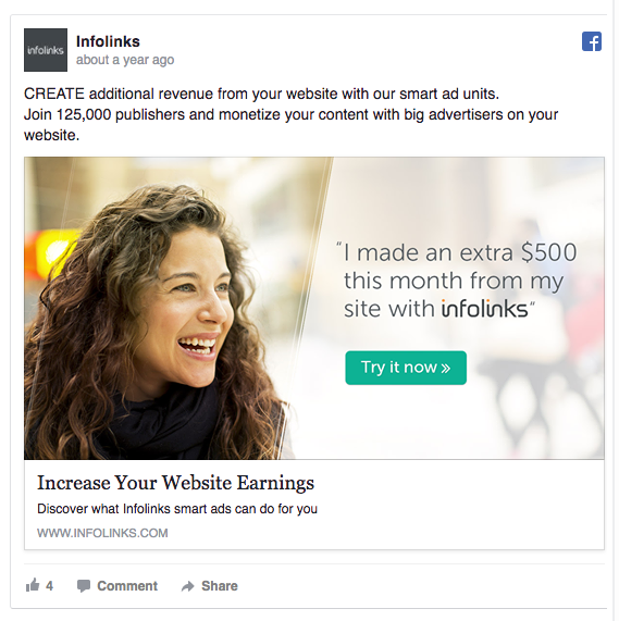
There’s a psychological term known as “mirror neurons” that suggests that seeing a certain emotion will cause a persons brain to mirror that emotion. Pretty cool right!? That being said using images that express positive emotions can cause viewers to associate those emotions with your brand. Take a look at this ad by Infolinks. Seeing this image of a smiling woman generates feelings of happiness in viewers, which are now associated with “Increasing Website Earnings.”
This technique is not limited to positive emotions. Feelings of sympathy and frustration can also be used to increase conversions. The use of these negative emotions will make viewers see the associated brand or product as a solution to resolving those negative feelings.
Another very effective way to successfully use emotion is to convey a sense of adventure or excitement. Salesfore Pardot and Eventbrite use this technique very well. If you take a look at theses ads you’ll see that the image has very little to do with what the ad is selling, but the emotion conveyed in these images will spark interest in Facebook users and make them stop scrolling and focus their attention on the rest of the ad.

We decided to test this technique here at SMSS for our Brand Strategy Conference lead generation ad. We ran a split-test using a standard branded image and a emotion-driven image and guess which one performed better. If you guessed the left ad, you’re right!! Our emotion-driven ad generated 84 form submissions, while the standard ad only generated 8.

#2 Use colors that pop
Facebook news feeds are saturated with thousands of images, so if you want your ad to get noticed you need it to POP! Focus on using colors that contrast with the rest of the news feed. Whether you’re using a stock image to express emotion or custom branded graphic make sure the colors are bright and will catch the viewers eye. To give you an idea of what this looks like take a look at the following ads we ran for our content library.

As you can see the left ad used an overlay which washed out the image and made it blend into the ad template. The text was also small and did not incorporate any visually appealing colors. For the ad on the right, we decided to put this technique to use. We picked an imaged that contrasted with the Facebook ad template and also incorporated bright colors to make our tagline and CTA pop! Although we didn’t split-test this campaign, we analyzed the data and the right ad performed significantly better than the left. Our new ad resulted in 25% more sign-ups and yielded a relevance score of 9/10 (five points higher than the left). WOW.
#3 Be consistent with your ads
This technique is very important for brand awareness. You want viewers to easily recognize your ad and associate it with your brand. This is not to say that your ads should always look identical. This will quickly bore your viewers, cause ad fatigue, and reduce your relevance score. However, you should aim to have an ad rotation system in place, and rotate ads that contain distinct characteristics viewers can link to your brand.
One easy way to do this is to always include your logo on the image itself. I’m a big fan of Eventbrite‘s use of their logo. Even though the image is different, the ad is immediately recognizable.

Another great way to ensure consistency is to create a branded look. Asana does a really great job of sticking to their chosen sea-foam green color making their ads creative, dynamic, and easy to identify.

#4 Add a tagline to your image
More often than not Facebook users use the image as the deciding factor as to whether or not the will engage with the ad, so it’s critical that your image is “saying” enough to pull them in. A popular technique to increase your ad’s performance is to include a tagline on the image itself. Because Facebook is a fast-paced environment and users feeds are constantly being flooded with information, you tagline is your one chance to spike interest. Focus on tag lines that are user driven.
The following ad from Shopify is a great use of the tagline technique. Not only do they grab the users attention by alluding to building a better future, they use the word “free” to pull them in. Note: they are also taking full advantage of the emotion technique by using this very “adventure-esque” image. Go Shopify!!
SoFi successfully uses the tagline technique by stating the problem they are providing the solution for. With a few words the grabbed the interest of their target audience by offering a solution to their problem.

When using this technique it’s important to be short and concise. Facebook punishes advertisers who use too much text in their ads images by reducing their impressions. If you want to know if your tagline will make the cut use their text overlay tool. This allows you to submit your image to see if it passes Facebook’s guidelines.
#5 Create themed carousel ads
This is a super cool feature that is often overlooked. According to MediaKix, carousel ads are 10x better at getting clicks than static posts on Facebook. The carousel feature allows you to tell a story with your ads. Instead of one image, headline, and description, you now have three! This makes it easy to provide viewers with an interactive experience. When using carousel ads, make sure that the flow of the ad makes sense. You want the ad to tell a story that viewers can easily follow.
Take this ad from Mini Cooper. They use a carousel to advertise the features of their newly released model. This is something that can’t be done with a single image ad. 
This ad on the other hand uses a carousel to tell a story by outlining the possible outcome of using their product. This allows viewers to visualize the benefits of signing-up (see “mirror neurons”).

Now that you have a few tricks in your pocket, we’re excited for you to start brainstorming some new ideas on how to take your Facebook ads to the next level. Just remember to find a technique that’s right for you. Even though these techniques have worked for other brands, you always want to make sure your using strategies that are best suited for your brand. The best way to find out is to split-test EVERYTHING! This is Facebook’s a/b testing feature that will run multiple ads and tell you which performs best. If you’re not sure what will work for your brand, try them all and let Facebook do the hard work for you.
Thanks for reading! If you want to know more about Facebook ads, subscribe to our newsletter and stay up to date on paid advertising and all thing social media.
Comment below and let us know what you think.


