


In the fast-paced world of social media marketing, you may find yourself needing to wear many hats to get the job done. Graphic designer is often one of those hats. Maybe you need to have super awesome creative done by noon and don’t have time to wait for your design team to draft something up, or perhaps you don’t have a design team in place to provide work on short notice. Whatever your situation is, having an understanding of design and being able to work your way around photoshop is a valuable tool to have in your back pocket.
However, many marketers will turn bug-eyed when presented with the idea firing up Photoshop and attempting to create visually appealing content. Graphic design can seem very intimidating, but in reality assured mastering simple designs is easier than you may think.
Take a look at the infographic from Social Recruiting Strategies Conference. It may seem like an impossible feat to accomplish if you’ve never been exposed to graphic design; but what if I told you by the end of this blog you’ll be able to create something like this with the snap of your fingers. Would you believe me?

Here at #SMSSummit we believe that the best way to learn is through an interactive, hands-on approach. I know it seems daunting, but I encourage you to create this graphic with me as we go. This will allow you to gain first-hand experience in the realm of photoshop and teach you skills that you can apply to a variety of future design projects. You can even take it a step further and customize the process to fit your brand; use your logos, your fonts, your colors and your own content.
For this article, I will be repurposing this infographic for our Social Media Strategies Summit in San Francisco. Are you excited? Because I am!
Introduction
Before we get started, let me introduce you to the tools we will be using throughout this process. These tools will be your BEST FRIENDS throughout your journey to becoming an “amateur graphic designer.”

I used Photoshop to design this. Talk about inception, right?
If you don’t see these tools on your tool bar, right click the image in the corresponding location and select the correct tool from the drop down menu. Also, don’t freak out if you don’t know what “layers” are, this will all be explained as we move forward.

Tool drop down menu
Now let’s go over setting up the file. Once you have Photoshop open, select file –> new. Name your file anything of your choosing. I decided to be creative and name mine “Infographic.”
Then, set your width to 1024 and your height 532, and make sure to select pixels from the drop down menu. For social media purposes, it’s always best to size your image depending on the channel you plan on using it for. For a detailed list of images sizes, check out Hubspot’s Social Media Image Size Cheat Sheet.
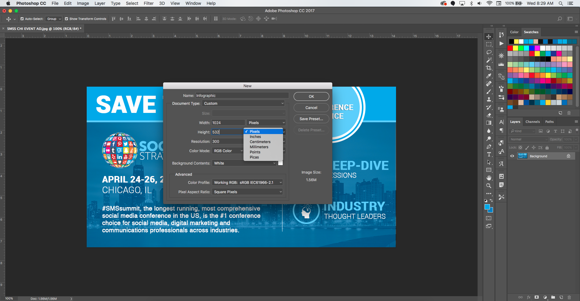
Once you have your file name and sizing set, press okay. This will create your background layer, or what I like to call – your canvas.
Step 1: The Backdrop
Our first step will be to add our city backdrop layer. When adding exterior images, I prefer the drag and drop method. Beware, that this may cause some image quality loss. However, I find that with small files this is an easier and relatively harmless method.
Once you have dropped the layer hit enter to secure its spot. Depending on the size of the dropped image, you may need to resize the layer. In this case, we will need to adjust the size so that it covers the entire canvas.
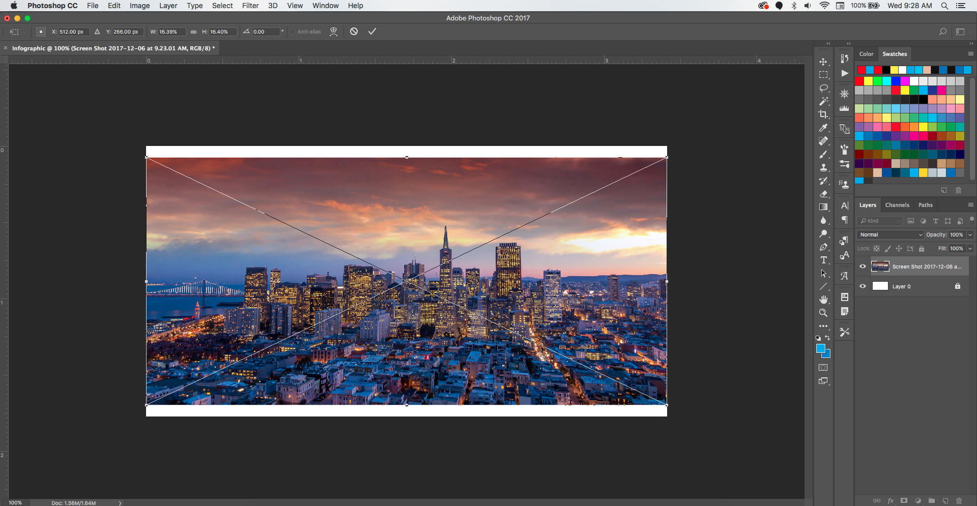
Before attempting to resize, make sure the correct layer is selected. When you select a layer, it will be highlighted in a lighter gray shade within the layer box. Once you’ve confirm that the correct layer is selected, you can begin the resizing process. Do this by selecting the move tool, and then pressing ctrl + t (command + t if you’re on a mac). This will allow the image to be transformed.
You can then resize the image by dragging any one of the four corners. However, it’s important to hold down the shift button when resizing. This ensures that the image properties are constrained and prevents the image from being skewed.

Now that our layer is sized correctly, we can continue with the next step. For the purpose of this graphic, we will need to add a black and white filter to this layer. We do so by selecting image –> adjustments –> black & white in the top menu bar.
Step 2: The Overlay
Next, we will add our overlay. Select the rectangle tool then head over to the top left corner and select the appropriate color. The “fill” box should be set to the color of your choosing and the “stroke” box should be set to translucent (white with red diagonal line).

Now, put your curser on the top left corner of the image and drag diagonally until the image is covered. This will create a new layer that should look like this.

In order to achieve the overlay look, we will need to adjust the opacity. Double click the layer within the layer box, and a pop-up menu will appear. It should automatically be set to “blending options,” but if not select this option from the menu bar on the left. Make sure the “blend mode” is set to normal and then reduce the opacity to 50% and select “okay.”

Step 3: The Borders
Now that we have our main backdrop all set, it’s time to get to the fun stuff. Let’s go back to our rectangle tool and select a lighter shade of blue to create the top border. Follow the steps from before, but make sure your layer only covers a quarter of the image. After creating a layer with the rectangle tool, always remember to press enter. This will drop the layer into place and allow you to move it around and resize using the move tool.

You will follow the same process for the second border, adjusting the sizing until it looks right.
Remember, whenever you want to move or resize a later, select the move tool, and press ctrl + t. This will allow you to move your layers around your canvas freely.

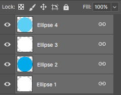
Step 4: The Circles
Now, let’s add our circles. To add circles, right click on the rectangle tool and select the ellipse tool from the dropdown menu. The process is similar to creating a rectangle; however, in order to create a perfect circle you will need to hold down the shift button as you’re dragging your cursor.
We will begin with first creating a white circle. Once created, right-click the layer in the layer box and select rasterize layer. There is a purpose for this but for the sake of this article, I will leave out the wordy explanation. You will repeat this process for the remaining three circles, making each new circle slightly smaller. REMEMBER: hold down the shift button. That is your best friend!

For our next circle, we will use the same blue as our top border. This color is likely already saved in your color swatches, but I will show you how to do a color grab using the eyedropper tool. When selecting the color, click the multi-colored box on the right of the drop-down menu. This will trigger another menu to open up. Scroll over to the color you want to grab (you should see the little eyedropper tool as your cursor) and click it. The color will auto-populate and you can now use it to create your next circle.

Your next circle will not be centered, but after creating it and hitting enter you can use the move tool to drag into the center of the white circle.


Wallah!! Okay let’s repeat by adding another white circle and then top it off with the final blue circle. This blue will match the second lighter border. You can play around with the size of the circles to give them a nice look, but your end product should look like this.

Once you’ve completed all the circles, you’ll want to link them. Linking layers makes it so editing one layer will also edit the linked layers. This makes it easier to resize and move multiple layers simultaneously.
To do this you’ll want to hold down the shift button (there’s that button again), select each circle layer, and then right-click and select “link layers.” If done correctly you will see a little chain-link icon next to each layer.
If it turns out you need to make an edit to just one of the layers, you can always unlink them by following the same process and selecting “unlink layers”.
Step 5: The Text
Now let’s start with the text. This is not tricky to do, but it can be tricky to explain so bear with me. For our brand we use the font Roboto, which you can download here. However, you can use any fonts you think look good for the purpose of this lesson. We’ll start with the top border text. Select the text tool, and create a text box by dragging the cursor; similar to how you would when creating a rectangle layer. Make sure the text box fits within the area you want to type. It should look something like this.

Now, select your font, size, and color from the menu bar. You can use your own judgement to decide what looks right. Like any other layer, you can move and resize text using the move tool. Just remember to hold that shift button.
We’ll do a similar process for the remaining text, but we’ll play around with the sizes, colors, and fonts. Photoshop’s text features are similar to any other program. They can just be a little tricky to find. You will find the bulk of the text editing features under the character icon (see below). If you want to know more about what these tools can do, check out this article by Photoshop Essentials.

You will want to create a new text box for each chunk of text. You can see how I divided my text chucks below. Your placements of the text boxes don’t have to be perfect as you’ll be able to move them around later, but try to insert them as close as possible to where you want them to be.

Step 6: The Images
Now let’s add in our images. You can use the drag and drop method to add in a cropped version of your logo. If you’re unsure want a cropped version is. It will typically be saved as a png file, and will have grey checkerboard background like the image below. This background will not appear once it is placed in photoshop.

Once you’ve dropped the image, you can move and resize to fit the layout of the graphic.
For the three icons on the right side of the infographic, I found relevant cropped images on google. You can type something in like “networking icon png file” and it will give pre-cropped images.
Once you have your desired icons, save them to your computer and use the drag and drop method to add them to your canvas. Often you won’t find them in the color you need, so a quick an easy way to change the color is to double-click the layer you want and select color overlay from the menu bar.

Step 7: The Finishing Touches
Now that we’ve got all our images added. Your infographic should be looking more like the finished product.
Wow, we’re so close I can almost taste it. The best part is that the next few steps are one’s we’ve already mastered!!

For our final steps, we will be adding a few rectangles and circles. Sounds familiar, right? We’ll start with adding the circles around the icons. Once you’ve selected your ellipse tool, head on over to the top menu to select the appropriate color. We will be matching it with the blue from the second top border.
This time it will be a little bit different. Instead of your stroke being translucent, you will apply the appropriate color to your stroke and set your fill to translucent. See the image below for a little refresher. Also note that I’ve set the stroke width to 5px, but you may choose whatever width you feel is appropriate.
 Since we’ll be doing three identical circles, you can speed up the process by duplicating the layer. Do this by right-clicking on the layer and selecting “duplicate layer.” Now you can use the move tool to drag that newly created layer to its appropriate spot right below it. Sweet!

Now for the last and easiest part, the dividers. To do this, just switch back to your rectangle tool and make sure your color is set to white. Drag your cursor down to create a rectangle of the appropriate height. Keep it as narrow as possible by avoiding dragging your mouse to the right or left while creating your rectangle. Your final image should resemble the one below.

WOW! JUST LIKE THAT YOUR HAVE YOUR FINISHED PRODUCT: A super cool infographic you created all on your own 😉
If your still with me at this point, thank you for joining me on this journey. I hope this post gave you valuable insights on how to improve your design skills. If you there is anything you’re confused about or something you’d like to know more about, just comment below and I will respond to the best of my ability.
Also, watch out for my next blog post which will outline a variety of creative techniques you can implement using photoshop.
Thanks for reading!


