


People don’t read nearly as much as they used to. (Just ask all those Goodreads users who failed, yet again, to complete their annual reading challenge last December.) And they do even less reading when they’re browsing online pages.
Websites are now optimized for skimming. Brands serve consumers hours of content every day, and attention spans are getting shorter. With all these challenges, ensuring that your blog content attracts and engages readers is harder than ever.
Fortunately, there’s a trick you can implement to ensure your blog content doesn’t scare off visitors. You can focus your energy on increasing readability.
What Is Readability?
Readability refers to the difficulty of reading and understanding a piece of written content.
A high readability score means that more people will understand the text. On the other hand, a low score means that the article is geared towards highly educated individuals or industry experts.
In business, the advice is to aim for as high a readability score as possible. You want to make your blog posts accessible to a large audience. (Unless, of course, your target audience consists of nuclear scientists).
With this in mind, the ideal readability score to aim for should fall between 60-70 on the Flesch Reading Ease test. Achieving this result ensures that 80% of English speakers understand your text. Moreover, getting this score is enough to get your marketing messaging across and start making your way towards above-average conversion rates.
You can check your readability score by using tools like Hemingway or Grammarly. These apps are free and helpful as they offer recommendations to make your content easily understandable to a broader audience.
However, the truth about boosting readability on your blog is that following AI-generated tips won’t be enough to engage your audience. You will also have to make some design choices to help your readers flow through your texts easier.
So, if you want to ensure your blog content doesn’t scare off visitors, here are a few best practices you can follow to achieve the absolute best results.
Consider the Impact of Color & Font
One of the easiest ways to undermine all your hard work when copywriting is to make poor design choices.
Yes, people love seeing and consuming beautifully designed content. Nonetheless, going over the top with color choice can significantly impede their ability to read and understand your blog posts.
According to UXmatters, the way to guarantee high readability levels is to look at the value contrast between body text and background color. The suggested minimum for readability is a contrast of 80%.
Naturally, the easiest way to maximize readability through color is to stick to a white background and use black text. However, UXmatters also offers a few alternative text color options, and all of them get an Excellent readability score.
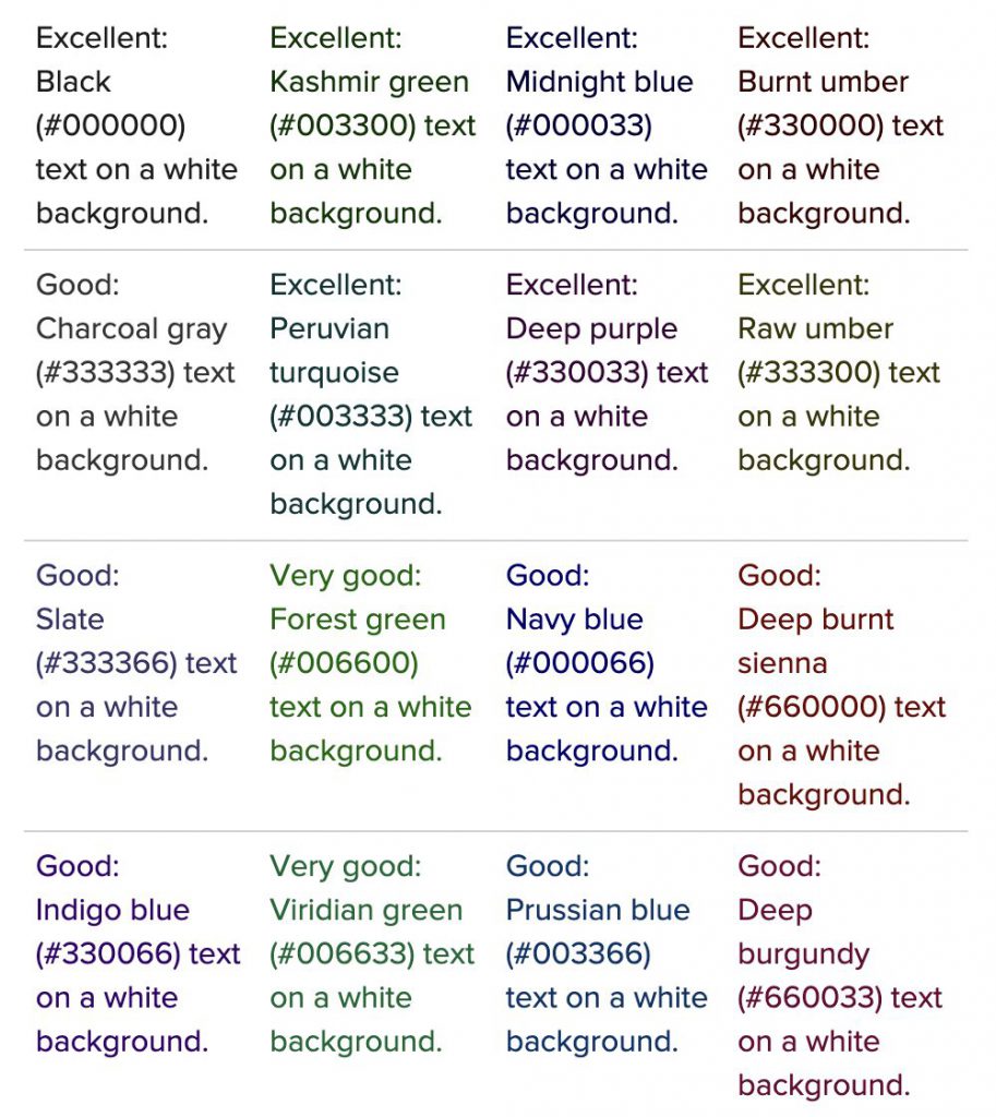 Source: uxmatters.com
When choosing color palettes for your blog content, you can pick any option. Each will ensure that your audience doesn’t have to strain their eyes to make out symbols or words. Moreover, these choices will prevent your readers from becoming fatigued by a clashing color combination, helping you keep them around on your website for longer.
As for typography, your best bet is to go with minamilism:
- Limit the number of fonts you use in your blog content (no more than 3).
- Use sans serif fonts. The U.S. Department of Health and Human Services recommends the following fonts: Times New Roman, Verdana, Arial, Tahoma, Helvetica, and Calibri.
- To boost readability and comprehension, go with fonts size 18 or larger coupled with a default line spacing setting of 1.0-1.5.
- Avoid special effects. They may attract readers’ attention, but they hinder readability and accessibility. When emphasizing high-value sections of your blog posts, you can get better results by playing around with color, typography, and text size.
Example: Skillcrush
Skillcrush uses color, contrast, and text size beautifully.
This brand’s blog section employs different heading styles to draw readers’ attention to text sections. It also utilizes design tricks to incorporate brand colors into the text.
If you look at the screenshot below, you’ll see how they underline each link with the same medium-light shade of red used for the brand’s logo.
 Source: skillcrush.com
The result of Skillcrush’s design-oriented approach to blog content is a post that is easy to read.
Mostly, this is due to the minimalistic design. But anyone can notice that the pared-down look doesn’t take away from the branding.
On the contrary, there’s plenty of it in the use of colors and images, a choice that helps readers create a connection between the content and the brand standing behind it.
Watch Your Language
Another common pitfall in writing blog posts is that writers often try to make their content beautifully written. We applaud this goal – if they’re Kazuo Ishiguro aiming for their next nomination for the Nobel Prize in Literature.
However, when writing for consumers and casual readers, the aim isn’t to write elaborate prose. It’s to make your content as easy to understand as possible.
Your best bet for doing this is to optimize your language and tone. Don’t try to be (too) clever or entertaining. Instead, get straight to the point and do your best to provide your readers with value.
One method for boosting readability through your language and tone is to avoid jargon and industry-specific terminology.
In 2019, scientists set out to study the relationship between language complexity and material understanding. They found that the presence of jargon in a text had several negative consequences:
- Jargon impaired people’s ability to understand what was written.
- It leads to resistance to persuasion.
- It increased risk perceptions.
- Industry-specific terminology lowered support for technology adoption.
In other words, using niche terms alienated readers. Additionally, it minimized their chances of engaging with the text or perceiving the products/technology discussed as beneficial to their needs.
Example: Zapier
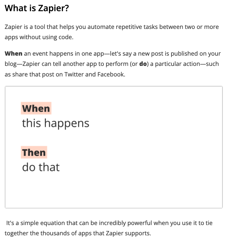
For an example of how you can optimize your language to be more inclusive, check out this Zapier blog post about social media automation.
Sure, the resource discusses a highly-technical topic. But the language is purposefully chosen to assist learning.
The article introduces the idea of task automation in an easy-to-understand way. It doesn’t go on about APIs and codes of software. Instead, it defines automation as a set of rules, making it understandable even to those with zero coding experience.
 Source: zapier.com
Secondly, the post defines each new term it introduces. That way, readers always know what’s going on, even if they aren’t familiar with concepts like RSS feeds or CRM software solutions.
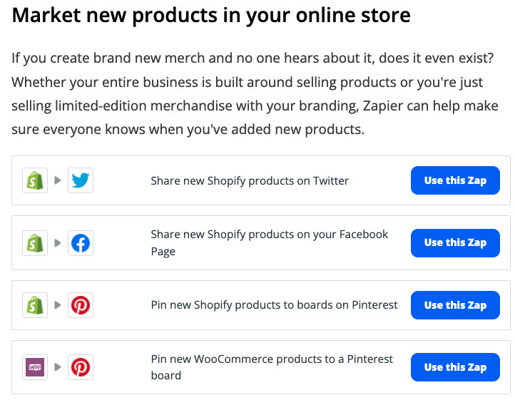
Finally, the text gives multiple examples for each strategy, making it easier for people to see what they can expect from Zapier’s automation software. It’s a small detail, but it goes a long way in boosting readability – especially because it combines visuals with text.
 Source: zapier.com
Avoid Walls of Text
What else can you do to ensure your blog content scores high in terms of readability? Well, one thing would be to look at the structure of your posts and try to find ways to make them more skim-friendly.
Remember that eye-tracking studies have shown that most people skim or scan text online. So, the best way to help readers get value from a blog post is to apply formatting tricks that guide their attention towards the sections most likely to provide them with value.
There are several super-easy ways you can do this. From a pure readability standpoint, you can:
- Write short sentences. Aim for an average of 20 words or less.
- Shorten your paragraphs. Organizing your text into short passages of 3-4 sentences gives you plenty of room to express your ideas without overwhelming readers with too much information bunched into a single section.
- Use visual cues to make reading easier. Numbered or bulleted lists are excellent ways to introduce info without becoming overwhelming.
- Keep punctuation as simple as possible. Full stops, question marks, and exclamation marks are acceptable. Commas are also fine as long as you keep your sentence structure simple. Minimize colons and semi-colons, which complicate text and impede readability.
- Chunking ideas into small sections can help your users understand information better than when displayed as a wall of text. It boosts comprehension and information retention, making it an excellent strategy for business blogs.
Example: Verywell Health
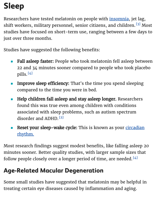
Check out how Verywell Health breaks up the benefits of melatonin use into clear categories like sleep, aging, autism, jet lag, etc.
 Source: verwellhealth.com
 - Use background colors or shapes to separate concepts. You can frame portions of text with a colored background, helping separate essential info from what is unnecessary for readers to get your gist.
Example: Scott’s Cheap Flights
See how Scott’s Cheap Flights uses a light orange background in its guide to using Google flights. Thanks to this approach, the brand effectively highlights the main pros and cons of using the service. Furthermore, it helps consumers get info more quickly, without reading the entire long-form article from start to finish.
 Source: scottscheapflights.com
 - Consider making some of your content collapsible to avoid walls of text. Collapsible content allows web visitors to explore your content bit by bit, skipping to the parts of your post they find most valuable.
Example: Optimal Workshop
Optimal Workshop does this with clickable questions. These reveal in-depth information about specific topics related to the brand’s tree testing software.
 Source: optimalworkshop.com
 Source:
 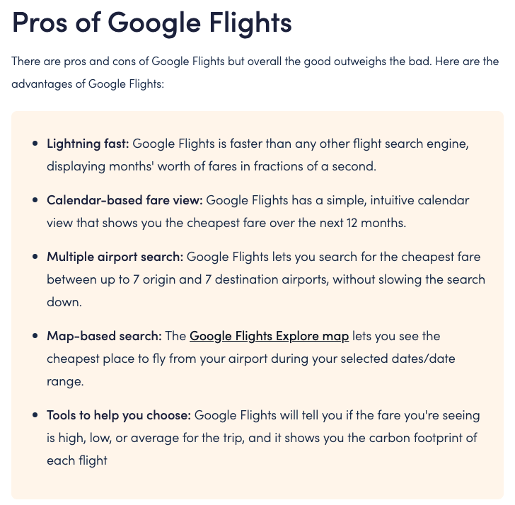 Source:
 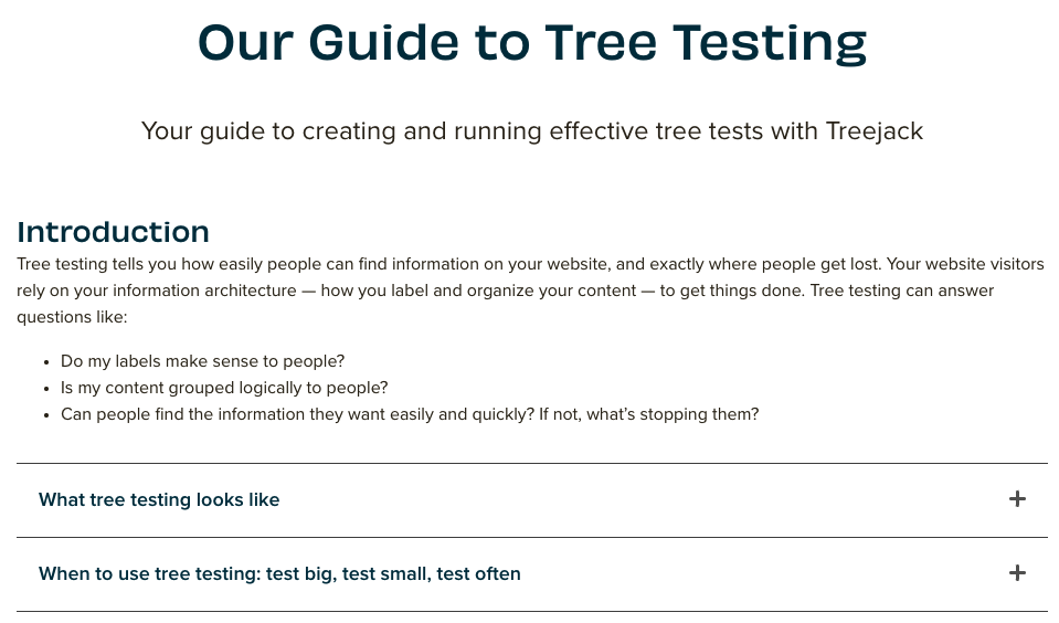 Source:
 Supplement Your Written Content With Video or Infographics
Another excellent method for boosting readability on your blog content is to add some visuals.
Images, infographics, and videos help guide user attention. Moreover, they invite readers to zoom in on different sections of your articles, which is a great trick you can use to draw attention to high-value areas of your blog posts.
However, you shouldn’t pepper your content with any picture you can find. Research from the NN Group discovered that internet users ignore fluffy pieces of visual content, signaling that stock and decorative images won’t improve the overall user experience.
However, if you have the opportunity to present some of your content in a visual format, you should try to do so.
Example #1: Jobvite
Jobvite does a great job with visual data representation. The brand’s content team knows that presenting stand-alone statistics doesn’t engage readers. Instead, the resources section of Jobvite’s blog includes beautifully-designed infographics. These creations combine valuable data, stellar writing, and aesthetic visuals.
 Source: jobvite.com
Example #2: Medical Alert Buyers Guide
Medical Alert Buyers Guide is a product-oriented brand. It uses product photography and videos to supplement the product reviews it publishes on its blog.
With a target audience that’s not very tech-savvy, providing visuals helps them understand the products better. And, consequently, it aids them in making the right purchasing decisions for their needs.
 Source: medicalalertsbuyersguide.org
Writing Great Blog Content Without Scaring Off Visitors
Content marketing is an excellent investment for targeting audiences at any stage of the buyer’s journey.
But, when writing long-form content, it can be challenging to strike the right balance between information availability and readability.
Unfortunately, failing to make articles user-friendly can result in a waste of resources. After all, blocks of text and flat design tend to scare off web visitors.
So, as you look for tricks to get more out of your content marketing strategy, don’t forget to consider readability. Make any necessary changes to make your texts easy to scan and comprehend.
It won’t just benefit your readers. It will also help you leave a better impression, maximizing web visitors’ chances of coming back to read the next piece of content you publish.


