Email marketing is a critical part of any digital marketing strategy. After all, data driven email marketing has the highest ROI compared to other digital marketing channels. But competition for attention in consumers’ inboxes is steep (the average consumer receives about 120 emails per day). So while it isn’t likely you’ll be moving your marketing dollars away from email any time soon, it is important that your campaigns are optimized for conversion.
We’ve compiled a list of design principles that should be incorporated into each and every campaign you send:
-
Reinforce your brand through templates, fonts & colors
It is pretty common for marketers (and designers) to think of each email as a separate campaign with a unique visual language, but that can work against you for a couple reasons. The first is that consistent visual messaging builds trust, and consumers have to trust a brand to let them into their inbox week after week. Consumers crave consistency, and want to know what to expect when they open your email. But that doesn’t mean that your emails don’t need to be creative. Rifle Paper Co. does a great job of balancing creativity and surprise within a consistent email template that has an on-brand periodical feel.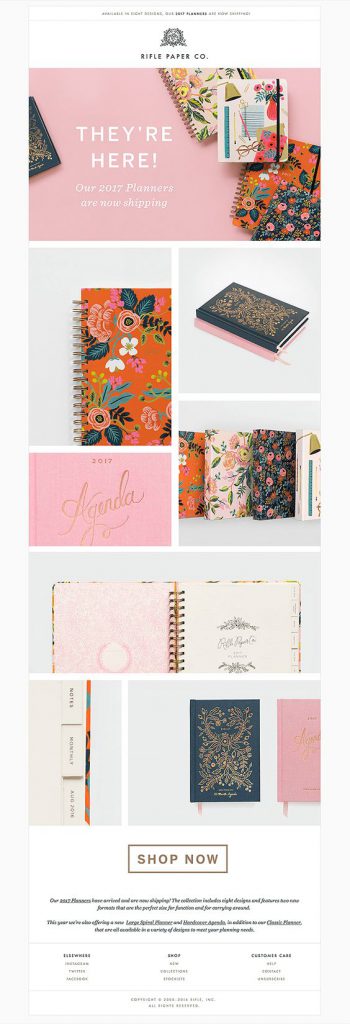
Aside from building trust, reinventing the wheel each time you design an email takes more time and resources. Marketers need to be agile in their approach to email marketing in order to capitalize on moments when it is relevant to send an email. By utilizing a formulaic approach to design, teams can cut down on design and revision time and get the final product out faster.
Best Practices for Brand Consistency:
- Develop a template that serves as the basis for all email campaigns
- Infuse creativity within the guidelines of the template
- Refer to your brand guide and use the same colors and fonts you would use on your website and other channels
-
Keep it Simple
We’re all familiar with long, scrolling emails favored by many retail brands. And looking at those campaigns, it can be tempting to stuff emails full of as many products or priorities as possible. But email readers are busy, and they are often checking mail while also doing something else (waiting in line, on public transportation, or while taking a quick break from a work project). That’s why it’s so important that email design has a singular focus, along with a single call-to-action. Not to mention that emails with a single call-to-action increased clicks 371%.
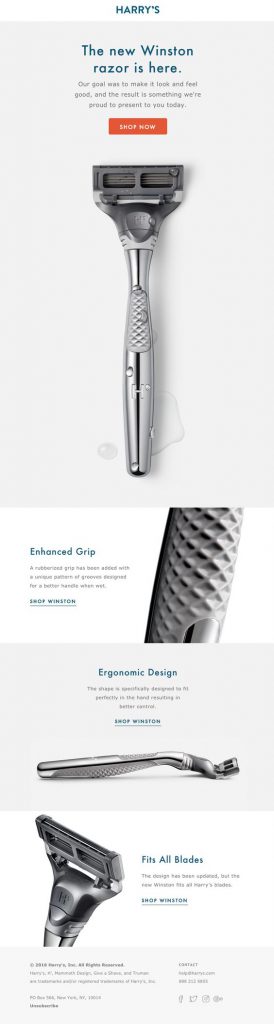
The Harry’s Razors email above is an example of using white space (any section of a document that is unused or space around an object) to draw the eye to the razor, along with brief messaging and a single button. In this email, there is no confusion, the reader knows exactly what to do next.
If you aren’t sure how to layout your email campaign to focus on a single element, you can use the inverted pyramid technique. This is a simple method of grabbing the reader’s attention, typically with a headline or a strong image, and then visually forcing their eye to narrow towards the call-to-action.
Best Practices For Keeping Design Simple
- Utilize white space to draw the reader’s eye towards the most important element
- Decide on a single call-to-action based on your campaign’s goals
- Experiment with text only emails or text based graphics
- Plan email content based on the inverted pyramid
- Incorporate directional visual cues like arrows to draw attention to specific areas
-
Use Snackable Content when you have a lot of details
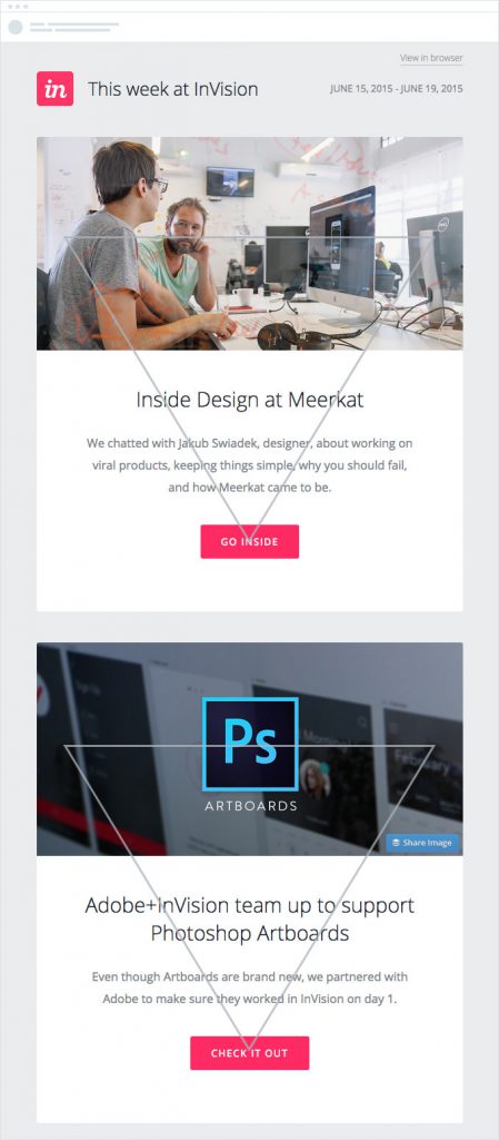
You only have about 3-5 seconds for your reader to connect to your content. This can seem daunting if you have a lot of information to communicate. This is when creating sections of focused, digestible content is crucial. The Uber example above does an excellent job of leading the reader through the important content. By pairing a headline with an icon, the message is easy to understand just by scanning the email. The details are all there for the reader who wants to know more, but for those short on time, they still walk away knowing what they need to.
![]()
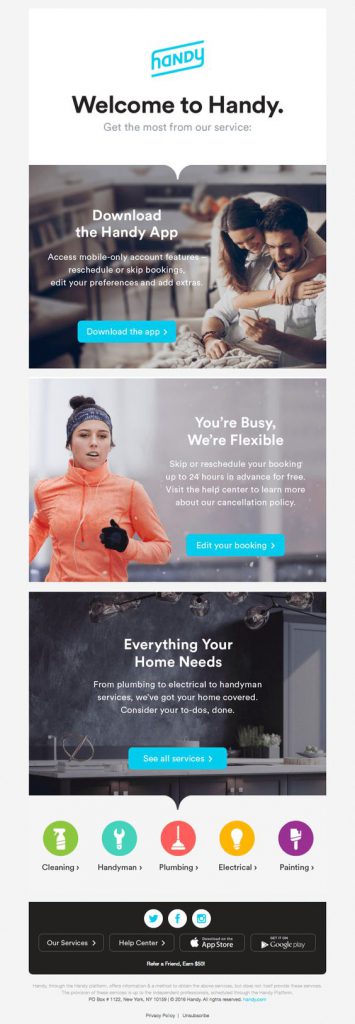
Handy, the on-demand cleaning and handyman service successfully uses three call-to-actions instead of one by incorporating the zig-zag design model. Breaking up the design into 3 rows with strong imagery and alternating the placement of buttons makes it clear to the eye which direction to move towards next.
Best Practices for Using Snackable Content
- Edit, edit, edit. Reduce the amount of words used as much as possible
- Layout content in a grid and break up with horizontal lines to create order
- Use the zig zag pattern to simplify sections and make text easier to read
- Consider telling the story visually through icons, infographics or short embedded videos
- Repeat the call-to-action
-
Embrace the Conventional Design Standards
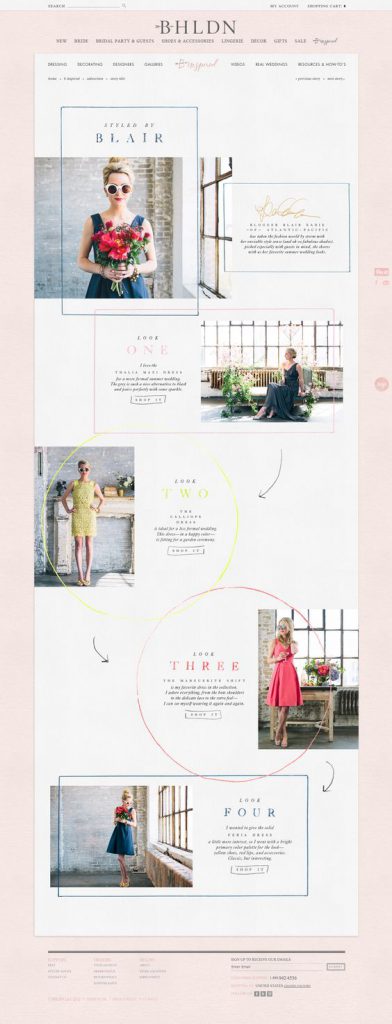
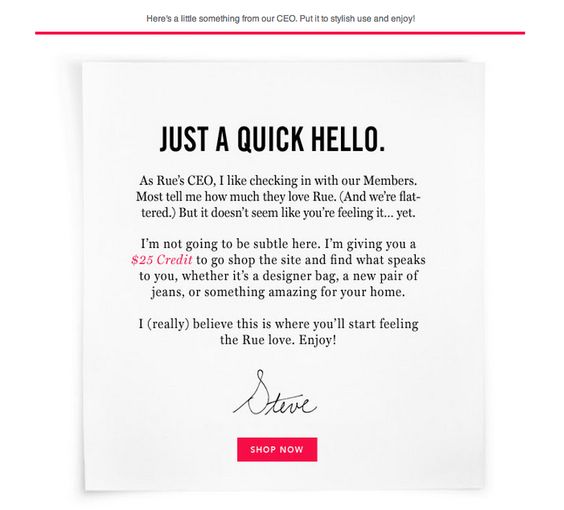
Although we keep reiterating the importance of consistency and focus, it’s also important to remember that you can still be creative within these guidelines. There are some great examples of beautiful (BHLDN’s ‘Styled by Blair’ campaign) and fresh (Rue La La’s totally unexpected ‘Quick Hello’ campaign) that follow the principles listed in this article.
Just remember, good design isn’t good if no one can use it; and good email isn’t good if no one can read it. That’s why there are a few design specs that simply must be followed to ensure your campaigns get delivered.
Best Practices for Email Sizing & Layout
- Set up your canvas to be 600 pixels wide (while some programs will allow you to go wider, some readers won’t be able to see your email properly)
- Use consistently sized type that works for both desktop and mobile (A general rule of thumb is that headings should be 30px and body type should be 20px
- Design within a single column
- Make your call-to-action button full width for mobile
- If you use text links, make sure they stand out (use a different color or bold text)
- Test to make sure your email is responsive and you like the way it looks on mobile
(63% of emails are opened on mobile)
Once you’ve gotten a first draft of your design ready, it’s helpful to follow one final principle of designers everywhere: Edit, Rework and Get Feedback.
- Use the squint test (Squint when you look at your design to see what jumps out. It should be the most important elements!)
- Walk away and look at it again later (Mistakes happen when you look at something for too long).
- Test it out (Send yourself a test and check links and open on different devices)
- Ask for feedback! (Get your team to test out your design)
Design can be a bit intimidating if it isn’t your area of expertise, but keeping these principles in mind will help you whether you are trying to D-I-Y it or to communicate with your design team better. It’s all about sharing your content in a way that keeps readers engaged and opening your mail, ultimately leading to greater conversions.


