By 2021, the total number of business and consumer emails sent is expected to reach 319.6 billion. That number is based on an expected annual growth rate of 4.4% since 2017. The reason for this growth is simple: email has a median ROI of 122%. That’s over 4x greater than any other marketing channel.
It’s definitely not a secret that email marketing is a powerful tool for brands to reach their consumers directly and motivate them to purchase. But with individuals receiving approximately 121 each day, there is a lot of competition to get your brand’s message opened.
Marketers need to develop tools to make developing and sending email campaigns streamlined and effective. Enter the email newsletter template. An email template is a preformatted email that you can use to update with new content, making it quick and easy to write and create emails.
Templates help marketers in three ways:
- They’re consistent: Consumers need to trust the emails in order to take action. Creating a consistent look and feel has a big impact on that. When creating an email from scratch, it is too easy to make a button a different color or change the location of a link. Templates help to avoid the small changes that can create an inconsistent user experience.
- They’re efficient: Templates allow you to create more campaigns in less time, with fewer mistakes.
- They’re cost-effective: There is an initial investment of time and money to develop your template. Once you have it, the ability to quickly customize a campaign pays for itself.
Now that we’ve convinced you of the power of email templates, here are 10 of the best examples to help inspire creating your new template.
1. Mailchimp’s email newsletter template follows layout best practices
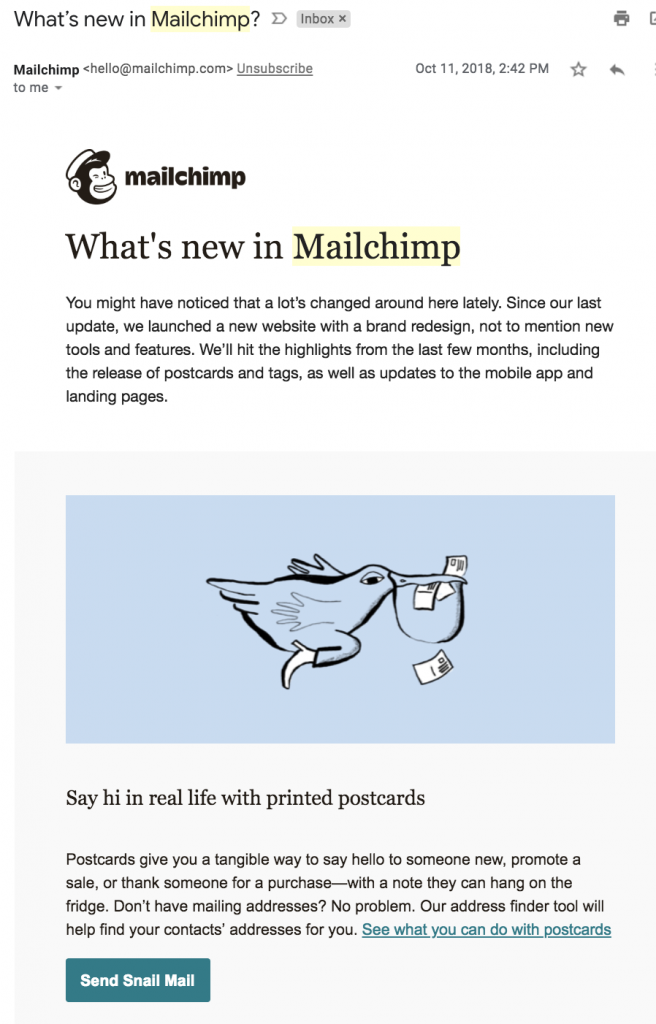
Mailchimp’s email newsletter template follows layout best practices
It should come as no surprise that the email platform Mailchimp has great email newsletters. Mailchimp knows that the best emails are the ones that make it into their viewers’ inboxes. Their templates are consistent and engaging, but more importantly, they follow layout best practices to ensure the messages get delivered.
Layout best practices to incorporate in your email newsletter template:
- Format your email as a single column that is 600-800 pixels wide
- Two-thirds of subscribers prefer emails that are mostly images (Litmus research).
- However, 43% of people disable images, and some email clients don’t display background images. Use a mix of images and text in your campaigns, and always assign images alt text.
- Approximately 46% of all email opens happen on a mobile device. If your email is not optimized for mobile, 80 percent of users will delete it. (Bluehornet). Use responsive design in your emails.
2. Buzzfeed encourages opens through attention-grabbing subject lines
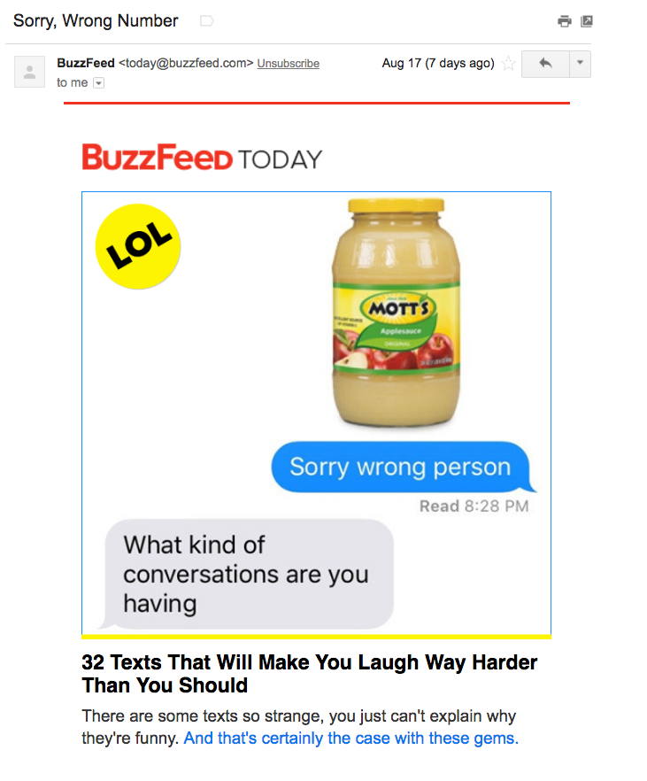
Buzzfeed encourages opens through attention-grabbing subject lines
Readers first impressions count. Buzzfeed uses a common theme to incite curiosity. Once inside of the email, the image answers the question that the subject line created for the reader.
If your subject line doesn’t grab their attention, chances are your message is going straight to the trash can.
Make your subject lines count by following these tips:
- Use a personalized subject line. You can increase open rates and click-through rates by as much as 35% by including the recipient’s name in a subject line.
- Use highly clickable words. According to Mailchimp, subject lines including words like “new”, “urgent”, “important” and “alert” are proven to increase open rates.
- Create A/B tests to learn what drives your subscribers to action.
3. Uber understands the reading habits of their audience
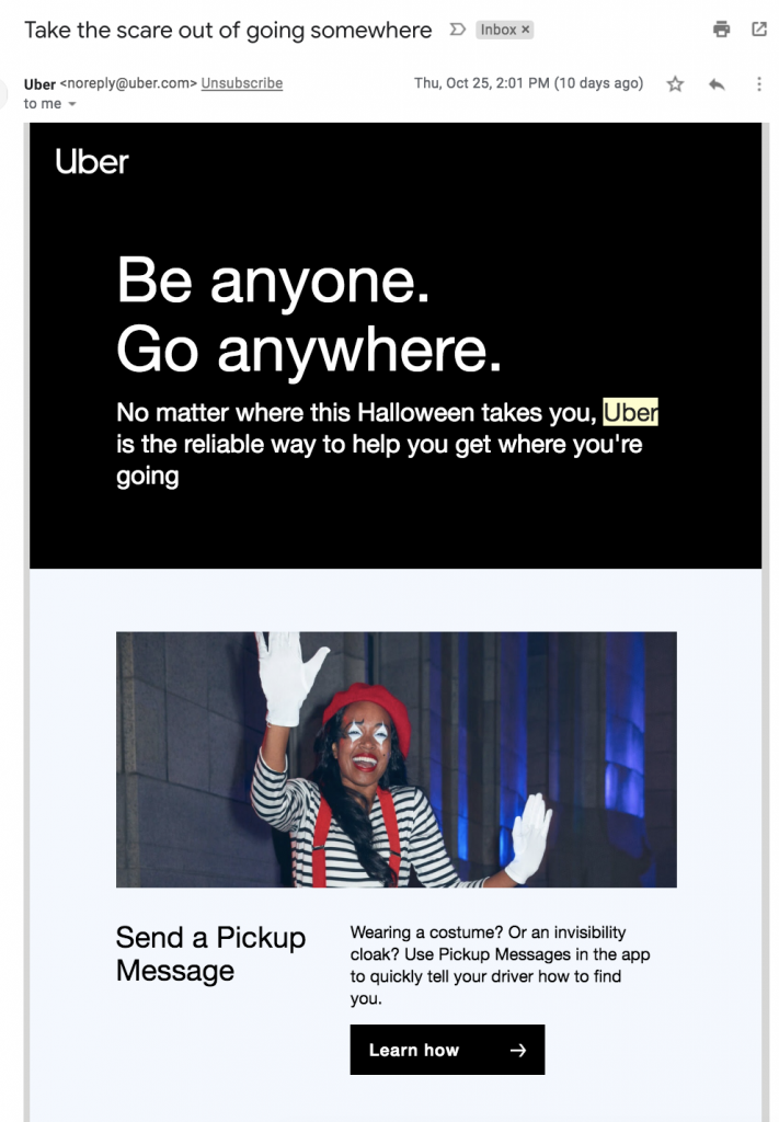
Uber understands the reading habits of their audience
Like many email readers, the Uber email subscriber is on the go. Uber uses consistent and simple design elements to break down their content so it is easily skimmable. It’s important to remember that even with short emails, recipients may not read all of the content.
Incorporate layout elements into your newsletter template to make content ‘snackable’:
- Create a hierarchy through the use of headings, subheadings and body text
- Use buttons to link to more information rather than text links
- Visually break up different topics with color blocks
- Break up text with images
4. Airbnb capitalizes on the power of peer recommendations
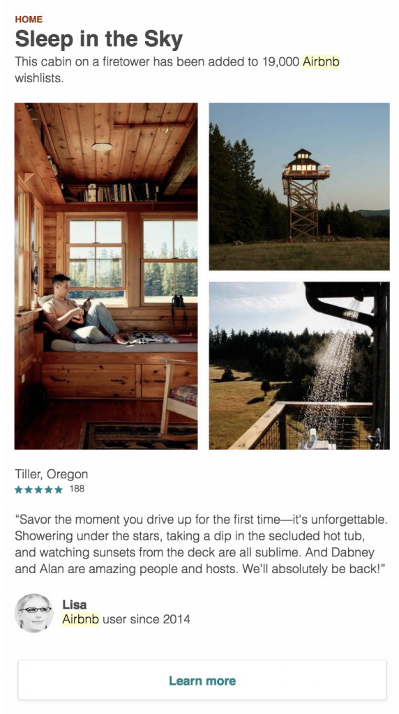
Airbnb capitalizes on the power of peer recommendations
Airbnb’s email newsletters are long, featuring a number of different homes, experiences, and places available on the platform. With so many choices, it can be easy to overwhelm the subscriber, so Airbnb uses customer reviews to spotlight the locations shared in its email campaigns. This is a smart tactic since 93% of customers say that their buying decisions are influenced by online reviews. BrightLocal found that 5-star ratings boosted click-through ratings by 28%.
5. TheSkimm’s email newsletter template encourages advocacy and interactivity
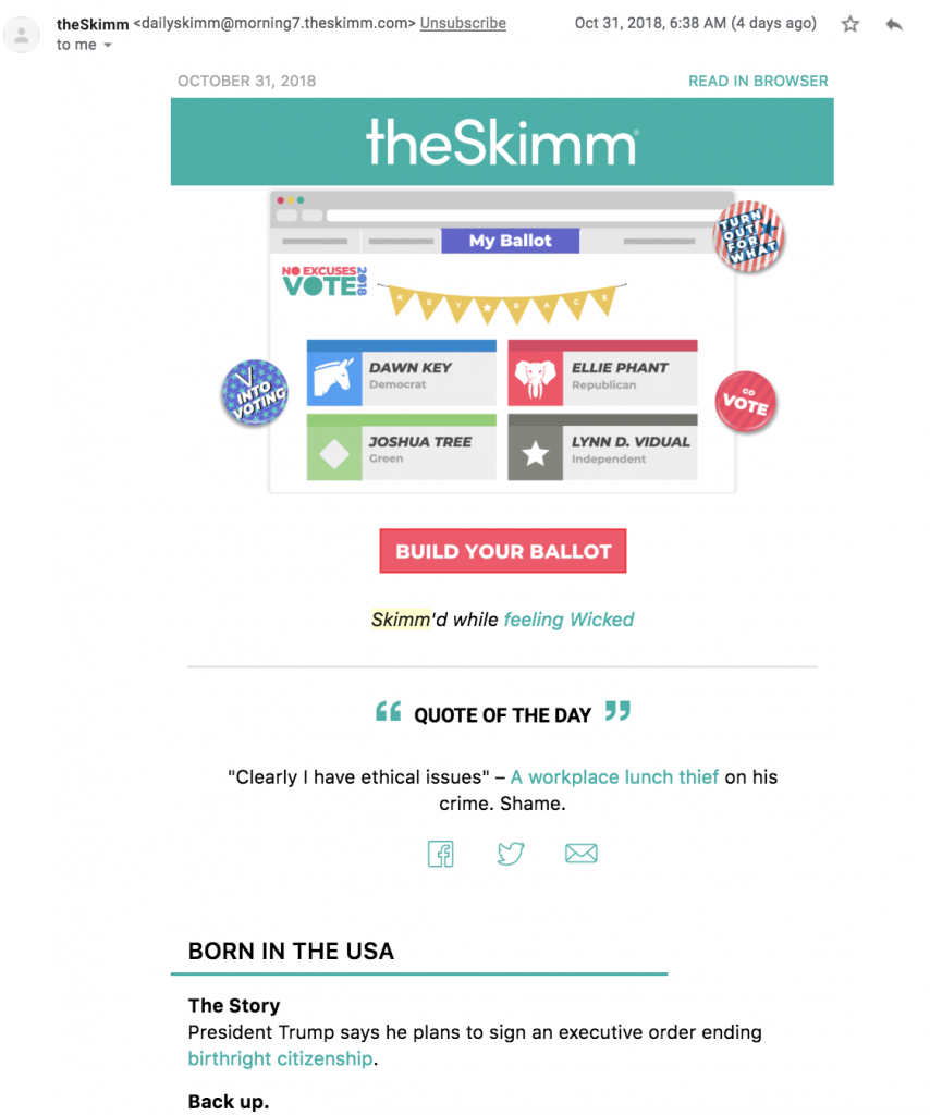
The Skimm’s email newsletter template encourages advocacy and interactivity
Email newsletter templates do run the risk of feeling a little stale, especially for brands that are sending emails daily. Although they follow the same format every day, Skimm avoids fatigue by including interactive elements in each campaign.
The Skimm newsletter begins with an interactive call-to-action that’s highly relevant. The example above was taken just before election day, offering readers an opportunity to ‘build their own ballot’.
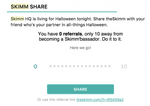
The Skimm’s referral program
Skimm also uses its newsletter to build brand advocacy. Email subscribers are 3 times more likely to share content on social media than visitors from other sources. They include social sharing icons under each newsletter block, giving the reader options to interact with the content and share with their friends. The newsletter closes with an opportunity for subscribers to earn points in exchange for sharing.
6. MM.LaFleur serves their audience first
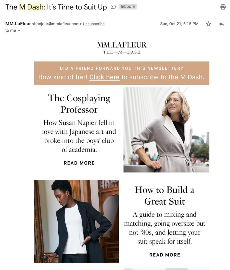
MM. LaFleur serves their audience first
MM.LaFleur’s marketing strategy is focused on the women who wear their clothes, rather than the clothes themselves. They believe that as busy and successful professionals, clothes are the least interesting thing about their customers.
To align with this strategy, MM.LaFleur turns the standard email template upside down. While most emails begin with the most important promotion (see the inverted pyramid approach to designing email), MM puts their promotion at the bottom. The primary block of their template is focused on sharing content from their blog, which is focused on their customers.
You may not be ready to make such a drastic shift in your email newsletters, but it is important to think beyond your promotional content to truly provide value to your audience.
7. Think with Google focuses on a single subject
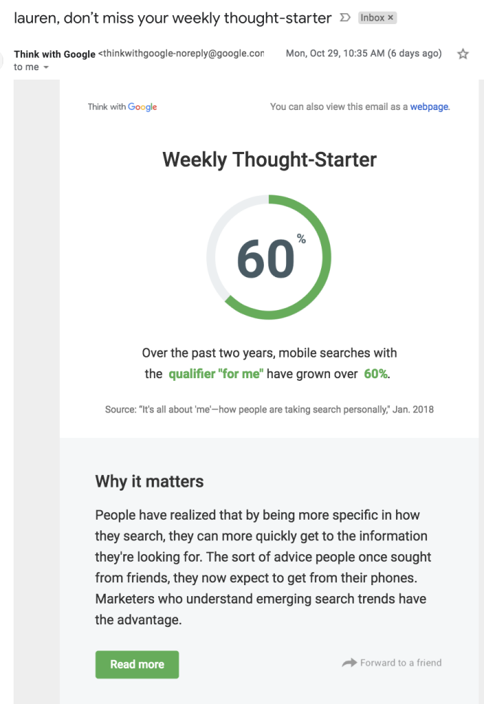
Think with Google focuses on a single subject
There is a lot of evidence to support the case for a simple and short email newsletter. According to Constant Contact, emails that are about 200 words long have the best click-through rate. Research also shows that emails that contain too many images or too many calls-to-action don’t perform as well as emails that include a single call-to-action. Think with Google’s weekly newsletter offers a strong example of how to create a template with one key subject.
Tips for creating a single subject template:
- Use one color to call attention to key elements
- Truncate copy and include a button where the audience can read or learn more
- Rely on simple images or icons
8. SXSW focuses the eye on a well-designed call to action
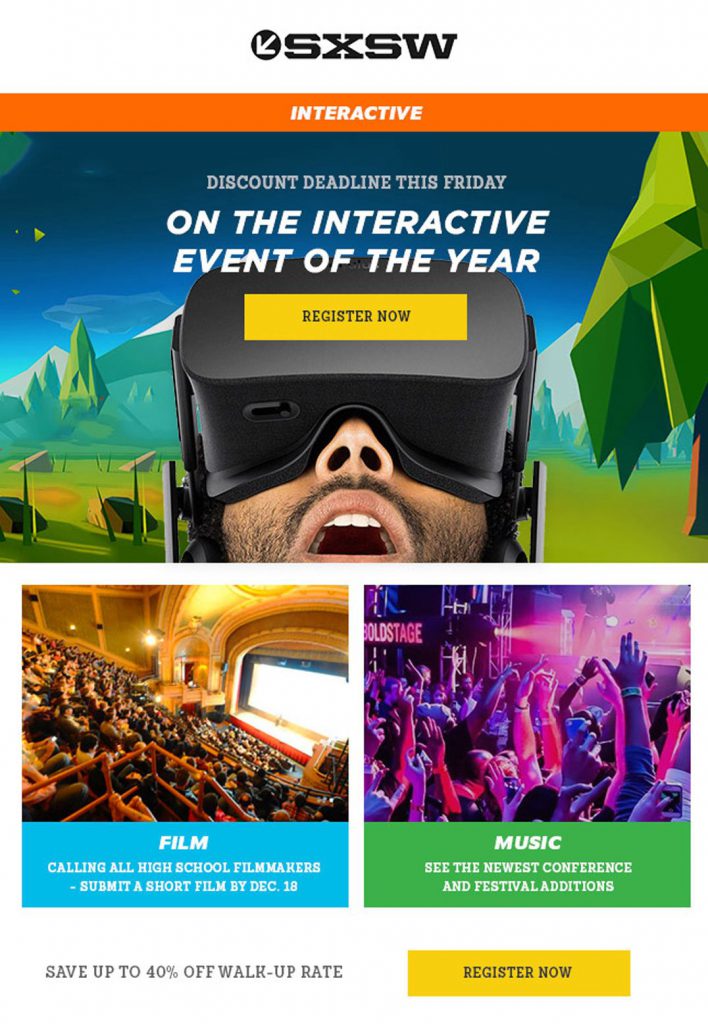
SXSW focuses the eye on a well-designed call to action
Copy and visual layout play a critical role in driving email click-through rates. The SXSW example above illustrates how to engage the reader visually to get them to take the next step. Instead of bombarding them with details about the conference, SXSW focuses their attention on the true goal of this campaign: to get the reader to click ‘Register Now’.
Tips for making your call to action drive clicks:
- Include the same CTA (call to action) multiple times within the email, at the top, middle and bottom of your template
- Make the CTA visible by using a bold, contrasting color
- Present the CTA in different formats, including text and buttons
- Test your link to make sure the CTA is actionable and takes readers where you want them to go
9. Copy and images work together in Artifact Uprising’s well-designed newsletter
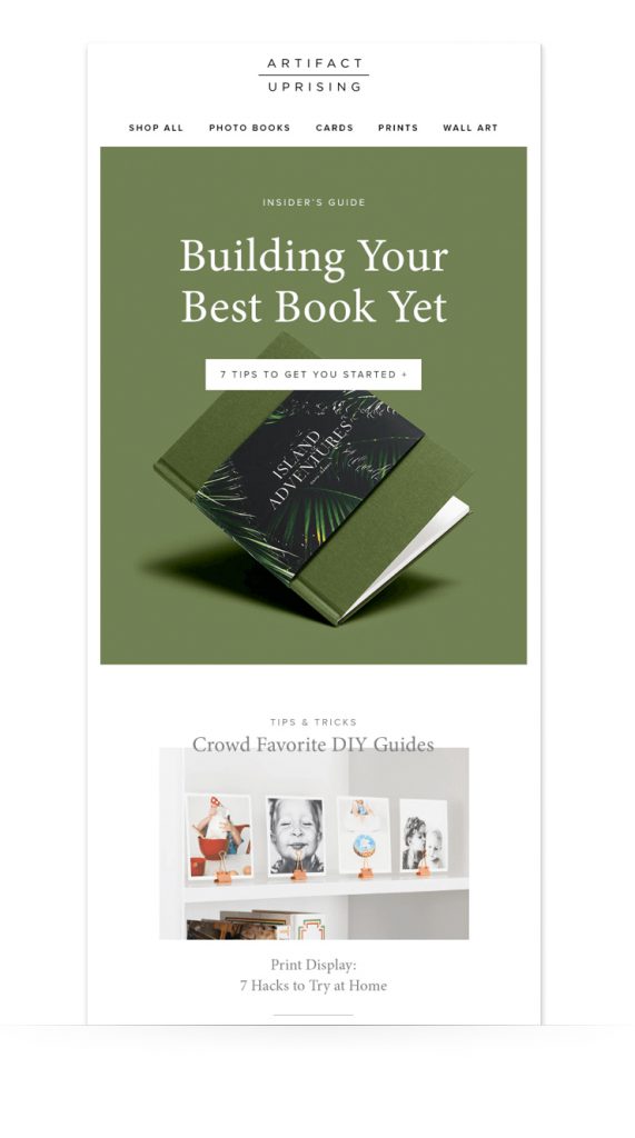
Copy and images work together in Artifact Uprising’s well-designed newsletter
According to GetResponse, emails with graphics have a higher open rate (26.89%) and higher click-through rate (4.36%) than text-based emails. The Artifact Uprising newsletter combines the need for strong visuals with copy that is concise and easy to read. By making their emails visually pleasing, the reader is not overwhelmed by long emails with multiple promotions.
Tips for a well-designed template:
- Leverage whitespace. Whitespace is the area between two design elements. It visually breaks up content and allows one block of a newsletter to breathe before leading the reader to the next one.
- Use contrasting colors. The Artifact Uprising example alternates between an olive green and white to create impact and ensure readers can see the images.
- Limit font types. Keep your design clean by limiting your font choices to one or two.
10. Have a conversation with Leadpages
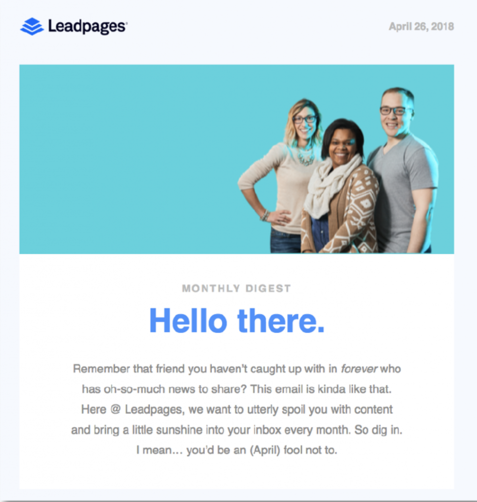
Have a conversation with Leadpages
An email from Leadpages is probably not the most exciting email in a subscriber’s inbox, but they their audience engaged by creating copy that feels like a conversation rather than a broadcast message. Keep your copy friendly by writing the way you (or your brand) would speak to someone on the phone. Encourage feedback by offering ways for the reader to reply, get in touch, or forward to a friend.
Conclusion:
More than 86% of businesses say they plan to increase their email marketing budgets next year.
If you are one of the many planning to invest more in email marketing in 2019, we suggest starting with building a strong template. This will help you to maintain consistency and create campaigns efficiently; ultimately allowing you to do more with less.
Here is our checklist of components to include in your email newsletter template:
- Setup layout in line with best practices
- Strong, engaging subject line
- Skimmable content
- Social proof or peer recommendations
- Opportunities to share
- Educational or informative content
- A primary message
- A clear call-to-action
- Clean, simple design
- Conversational copy
To learn more about social media, marketing, and branding best practices, join us for one of our upcoming events or digital summits.

